With the many changes and additions to the game, we did a much needed interface update, to better suit current game’s needs, and better serve you. Plus, it allowed us to do more performance improvements that will use up less video memory, considerably decreasing the chances of a freeze on slower computers.
Main Toolbar
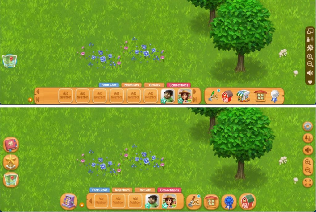
- The old Main Toolbar has been replaced with individual buttons, giving you a clearer view of your farm. Unlike the Full Toolbar, which blocked part of the screen, these buttons keep the interface minimal and unobtrusive. They only appear when needed, allowing you to fully immerse yourself in your farm without distractions.
- This also allows a much more configurable layout when visiting other farms. Instead of the big bar having only 1 button and being mostly empty, it now only shows the needed buttons for each situation, reducing clutter and avoiding confusion.
Value Bars
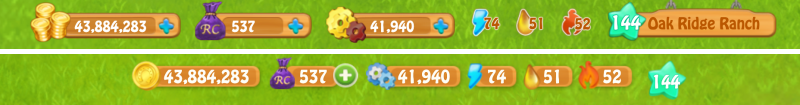
- The Value Bars (Power, Fuel, Energy, OP, RC, Coins) now have a bigger font size, increasing from size 16 to 19, making them easier to read. Their width also adjusts automatically, so if you have billions of coins, the full number will be visible. Even though each value bar takes up less space overall, these changes ensure that all your values are clear and easy to see.
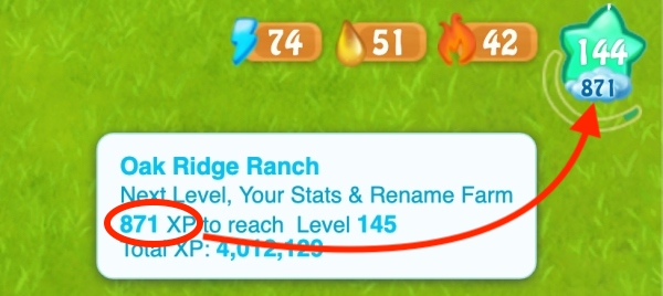
XP Bar
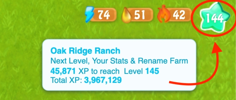
- The XP bar has been redesigned with a green-on-white progress bar that wraps around the star. When unwrapped, it’s longer than the old progress bar, making it easier to track your level progress. Plus, each tip of the star gives you a bonus, which you can collect from the Next Level tab.
- We’ve added a Rain countdown warning! When the remaining XP drops below 500 (for levels 20-50) or 1,000 (for level 50+), a Rain cloud appears. This ensures you’re always prepared for level-up Rain by having crops planted and trees harvested in time.
Right Toolbar
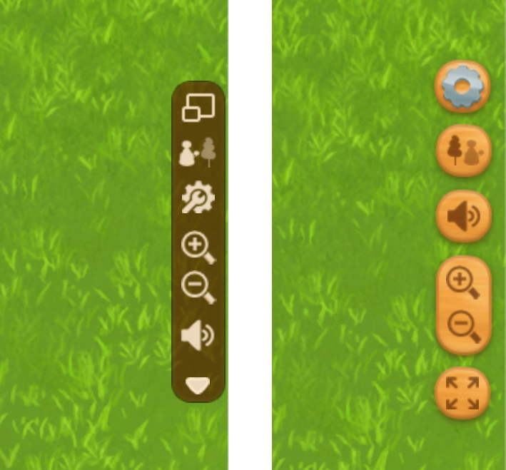
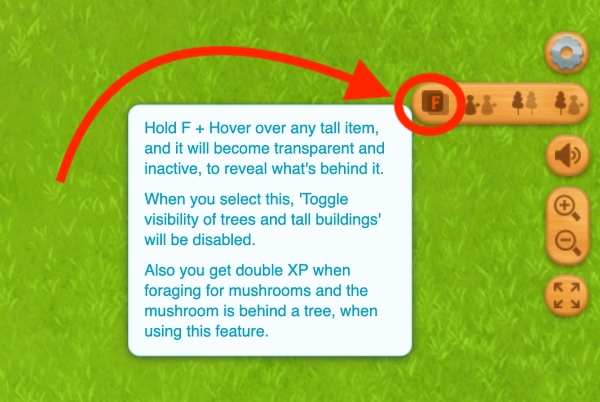
- The Peek Behind Tall Objects option has been added to the transparency buttons bar, making it easy to switch between modes. It also clearly shows when it’s active, so you always know if it’s turned on or off.
- When you deselect a button in Settings for the Right Toolbar, you simply make it appear above the Settings button, when you hover over it.
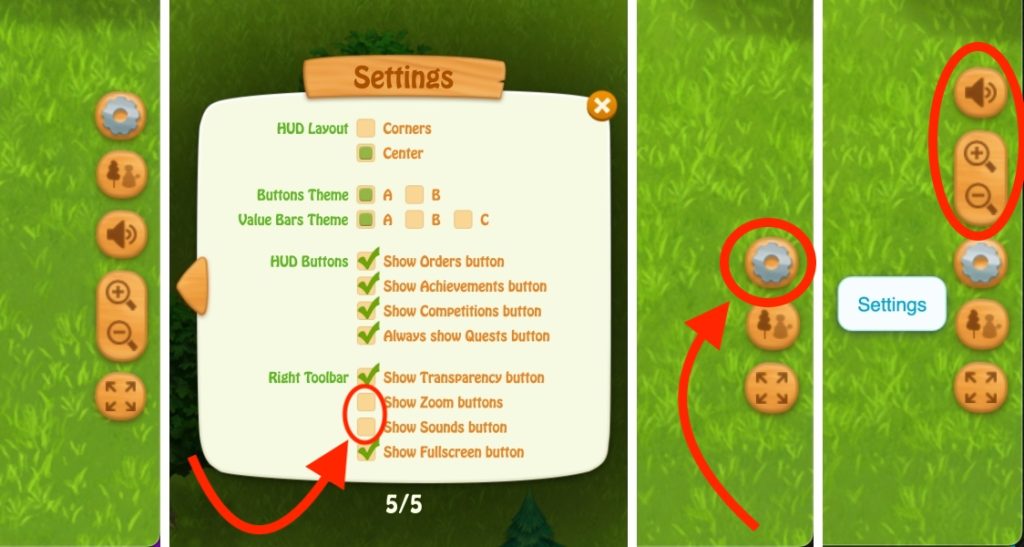
Image 2: “Zoom” and “Sounds” deselected from Settings
Images 3 & 4: While hovering over the Settings button, “Zoom” and “Sounds” reappear above
Refreshed Icons
Each icon now has its own unique dominant color, unlike the old icons, which all looked the same. We’ve carefully designed the layout and color themes to make each button easily recognizable at a glance:
- The Multitool is now fully brown, representing its connection to soil and farming tasks.
- Neighbors is light blue
- Quests is burgundy as old books
- Achievements is royal dark blue
- Barn is the iconic red & green
- The Shop icon is now a purple cash register because, well, all other colors we tried were confusing and clashed with the other icon colors.
- The Automation (OP) icon has been redesigned with blue tones to better match the gear theme, as the old design had too many golden icons.
Neighbors visiting
- Visiting neighbors is now simpler—no more choosing where to go each time. Clicking on a neighbor will take you directly to their farm by default. If you want to choose a specific location first, just hover over their image until a menu card appears with location buttons. After you arrive at their farm, you’ll also find location buttons there, too.
- We’ve cleaned the visuals and redesigned the cards that appear when you hover over a neighbor. Now, you can see all their information at once.
- The Neighbors bar has 5 slots if HUD layout is centered, is dynamic with 5-10 slots if the option you’ve selected is corners, and has up to 20 neighbors when visiting.
Completely Redesigned Quests System
- We’ve introduced a brand-new Quests system and window, where you can view all your quests from all areas on the map, in one place. This change also means we’ve removed the quest circles, which used to be annoying and overwhelming, especially if you didn’t want to do Quests.
- The button stays visible even if you uncheck the “Show Quests” option. This ensures you don’t forget about quests, in case a future quest catches your interest. With the old, small “hide quests” button, it was easy to forget about them.
Settings
The Settings menu has been redesigned and split into five clear sections, each with its own specific function:
- Main controls
- Gameplay customizations
- Notifications
- Interface customizations
- HUD customizations
Achievements
Redesigned Achievements tab
– now Achievements are displayed on cards instead of strips and are animated.
– when you hover over an Achievement picture, it enlarges to show the full size of the Achievement.
– each Achievement has a progress bar, so you can easily and visually keep track of your progress.
Redesigned Mastery tab
– Mastery now has a cleaner look, with some improvements and fixes.
Redesigned Collections tab
– Your collections are now displayed in a wooden box with a nice depth effect.
Completely redesigned ribbons
– all 7 ribbons have been completely redesigned, with gorgeous details and colors, worthy of your hard work earning them.
New Ribbon Earned popup
– each time you earn a Ribbon, there’s a new popup that also has a gift box inside, as an extra reward. There are 5 new custom popups, depending on the Ribbon you earned.